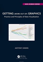
 Название: Getting (more out of) Graphics: Practice and Principles of Data Visualisation
Автор: Antony Unwin
Издательство: CRC Press
Серия: Data Science Series
Год: 2024
Страниц: 447
Язык: английский
Формат: pdf (true), epub (true)
Размер: 62.7 MB
Data graphics are used extensively to present information. Understanding graphics is a lot about understanding the data represented by the graphics, having a feel not just for the numbers themselves, the reliability and uncertainty associated with them, but also for what they mean. This book presents a practical approach to data visualisation with real applications front and centre. The first part of the book is a series of case studies, each describing a graphical analysis of a real dataset. The second part pulls together ideas from the case studies and provides an overview of the main factors affecting understanding graphics. There is a range of different software systems for drawing graphics and everyone has to decide for themselves which one(s) they want to use. Getting details right may be easy with one software and difficult with another. New software releases may provide new options and sometimes substantial improvements. How exactly the graphics are drawn is not important, what the graphics look like and whether they achieve the aims they are intended to is. This book is primarily about how to interpret graphics, not so much about how to draw them. The graphics in this book have all been drawn with R. Other software could be used to draw the same or similar graphics; in some cases, it might be easier, in others harder. Use the software that suits you best. The R code for the book can be found in the gitbook version on the web. You will need to have some knowledge and experience of working with R (R Core Team) and the group of R packages known as the Tidyverse. Some users prefer base R for drawing their graphics and may use packages such as lattice and vcd.


